
Yield Surface on US Bonds
- Frankie Monzon
- Aug 19, 2018
- 1 min read
While many people are familiar with the idea of the yield curve, a plot of the yields on the set of all available bonds, ordered from shortest to longest maturities, for a given country, very few people discuss or have visualized these data on a time series basis.
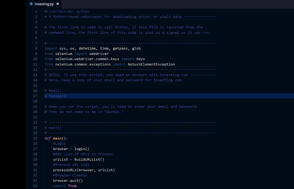
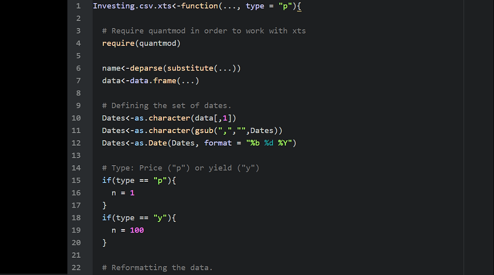
With the help of Python, R, and Plotly, we've collected data on the set of available US government bonds from Investing.com, and have visualized these in a surface plot, showing that over the last 5 years there has been a significant increase in near-term rates at the front of the curve, indicating the likelihood of continued flattening of the curve, and possible inversion in the near term.
Check out Plotly for the data!
https://plot.ly/~fmonzon/3/

Comments